Chapter 1
Chapter 1 - Introduction to Data
Learning Objectives
- Identify the type of variables (e.g. numerical or categorical; discrite or continuous; ordered or not ordered).
- Identify the relationship between multiple variables (i.e. indepedent vs. dependent).
- Define variables that are not associated as independent.
- Be able to describe and identify the difference between observational and experimental studies.
- Distinguish between simple random, stratified, and cluster sampling, and recognize the benefits and drawbacks of choosing one sampling scheme over another.
- Identify the four principles of experimental design and recognize their purposes: control any possible con- founders, randomize into treatment and control groups, replicate by using a sufficiently large sample or repeat- ing the experiment, and block any variables that might influence the response.
- Use appropriate visualizations for different types of data (e.g. histogram, barplot, scatterplot, boxplot, etc.).
- Use different measures of center and spread and be able to describe the robustness of different statistics.
- Describe the shape of distributions vis-à-vis histograms and boxplots.
- Create and intepret contingency and frequency tables (one- and two-way tables).
Assignments
Homework
OpenIntro Statistics
- Practice: 1.7 (available in R using the
data(iris)command), 1.9, 1.23, 1.33, 1.55, 1.69 - Graded: 1.8, 1.10, 1.28, 1.36, 1.48, 1.50, 1.56, 1.70
For 1.48, the following R code will create a vector scores that can be used to answer the question:
scores <- c(57, 66, 69, 71, 72, 73, 74, 77, 78, 78, 79, 79, 81, 81, 82, 83, 83, 88, 89, 94)
Lab 1
The labs are available in the DATA606 R package. To start the first lab, use the startLab function. This will copy the lab to your current working directory and rename the file according to your computer username (as returend by Sys.info()['user']). If this is incorrect, then either provide the file-prefix parameter to startLab, or rename the file after it has been copied.
startLab('Lab1')
Readings
- OpenIntro Statistics slides
- ggplot2 -
ggplot2is an R package by Wickham that implements the grammer of graphics (Wilkinson, 2005) in R. I will frequently make use of the graphing framework throughout the course and is worth learning. - Visualizing Likert Data - An R package for visualizing Likert scale data built on the
ggplot2framework. - Quick-R base graphics - Covers many of the visualizations using R’s base graphics.
Videos
OpenIntro provides a number of videos. You may find these helpful while reading the chapter.
Case Study: Using Stents to Prevent Strokes
Data Basics: Observations, Variable, and Data Matrices
Observational Studies and Sampling Strategies
Summarizing and Graphing Numerical Data
Using Randomization to Analyze a Gender Discrimination Study
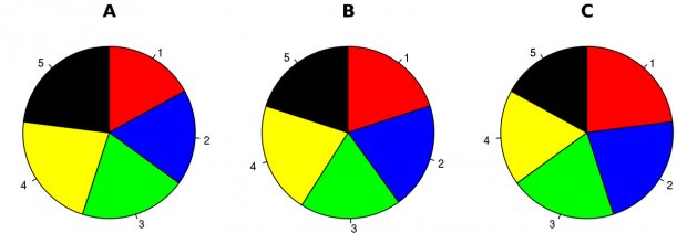
Note about Pie Charts
There is only one pie chart in OpenIntro Statistics (Diez, Barr, & Çetinkaya-Rundel, 2015, p. 48). Consider the following three pie charts that represent the preference of five different colors. Is there a difference between the three pie charts? This is probably a difficult to answer.
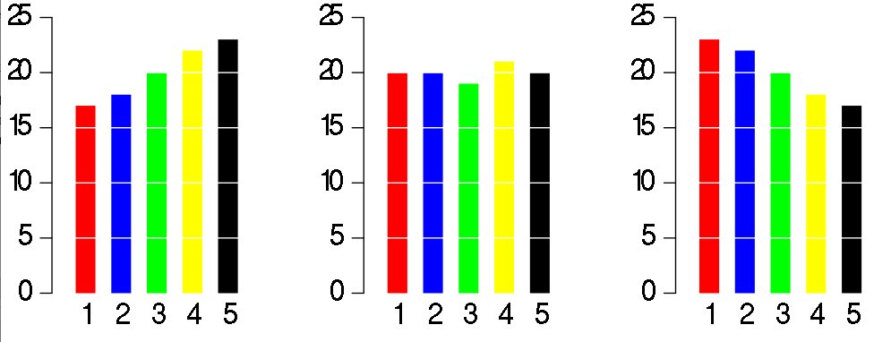
However, consider the bar plot below. Here, we cleary see there is a difference between the ratio of the three colors. As John Tukey famously said:
There is no data that can be displayed in a pie chart that cannot better be displayed in some other type of chart